Estimates of pLQ by Integrating Growth Distributions
Understanding the Propagation of Volatility in log(scp) to log(LQ)
In the previous section, we explored the estimation of level curves of equal probability for surpassing the threshold using a nearest neighbors (knn) fit. However, while a fitted knn model may align with empirical observations, it lacks analytical tractability. This section introduces a formal model to address this limitation, providing insights into the qualitative patterns of size distortions observed.
Growth of a variable over time, known as log jumps, is naturally linked to the variance (volatility) of the variable when considered as a time series around a stationary value. The goal of this section is to explore how jumps in variables and propagate to jumps in the variable .
The width of jumps (its volatility) is not the whole story. Whether a given jump results in depends on the observation's position relative to the line. By integrating growth distributions, we can estimate the likelihood of ending up with after a time period, based on the starting point and the distribution of jumps in and .
Formalizing the Probability of Exceeding the Threshold
Consider the setting in one dimension, focusing on before generalizing to two dimensions. The probability that within a time period, known as pLQ, is linked to the growth distributions of . If, after a time period, points near shift by , distributed according to:
The condition is fulfilled if:
To estimate pLQ, we weigh all possible jumps within a time period and sum the chances that exceeds the gap to zero. Formally, the probability of a jump in LQ being sufficient to surpass the threshold is given by:
This integration of growth distributions serves as an estimation of pLQ, as illustrated in Figure 1.
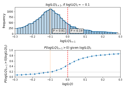
Figure 1: The top histogram shows where points near ended up in the next period, representing an empirical version of the growth distribution . Highlighted points surpass the threshold. Their area equals the height of the corresponding dot in the lower plot, corresponding to the integral in equation integratepLQ1. The bottom plot shows probabilities that in the next period as a function of , similar to Figure 2 but within a narrower range. The variable is aggregated for illustration.
Footnotes
- When considering differences in log levels, satisfactory results require a nearly continuous support distribution. For count data, many observations fall below (see Figures 3 and 4), constraining log differences to a few values influenced by initial levels. Trade data typically shows larger figures (minimum of in our data), making it better suited for this analysis.